
t was the late 1940’s. Walt Disney was working on Cinderella, his high-profile fairytale follow-up to the breakthrough Snow White and the Seven Dwarfs, which was not only a cutting-edge technological accomplishment but an emotional one as well. With Snow White, Walt proved that feature-length animated films could capture an audience’s attention, and move them in unexpectedly profound ways. The production of Cinderella came at a crucial time for the studio, too: the outbreak of World War II meant that distribution abroad had dried up, domestic production was subsidized, and the studio had released a string of hugely ambitious, adventurous features. And while production costs onCinderella had to be frugal, Walt also knew that it couldn’t look low budget. He wanted it to be distinctly, strikingly beautiful.
So, he called on Mary Blair.
By the time Cinderella was released, Blair was almost 40. At 20 she had won a scholarship to the Chouinard School of Art in Los Angeles, where she studied to become an illustrator. It was here that the then-Mary Browne Robinson met her future husband, Lee Blair. He was another scholarship student, and her involvement with Lee led to an interest in fine-art painting. Together they developed a handsome style of watercolor painting that was very popular during the Depression and exhibited in galleries nationwide. At this point her art was lovely but lacked definition. In 1938, Western Woman magazine described Blair as “one of the younger Los Angeles artists who is gaining recognition for the sincerity and originality of her work.”
While their paintings were popular enough, the Blairs remained starving artists. In 1938 Lee joined Disney to work as a color director on Pinocchio and Fantasia. By 1940, Mary had “reluctantly” (her words) signed with Disney. (She, after all, was a painter.) Her first job was as a meagerly paid sketch artist on what would one day become Lady and the Tramp. Soon she was working on stranger, more ambitious projects, like “Penelope and the Twelve Months,” a time travel tale about a young girl and a grandfather clock that was the first work to feature her doll-like characterizations. She also worked on “Baby Ballet,” a segment for a proposed Fantasia follow-up.
And while her art was stunning, it wasn’t fully formed. As John Canemaker, a Disney historian and author of a pair of books on Blair (liberally referenced here), notes, she was still reporting to animation supervisors Joe Grant and Sylvia Holland. Her drawings from that period “look like the work of three different artists,” asserts Canemaker. She described this work as “interesting,” but would soon be pulled away from the contentious atmosphere of Los Angeles (a strike had paralyzed the studio and the country was on the brink of World War II) by Walt, who asked her and several Disney artists (including her husband) to go with him to South America. It was there that they would embark on an extended goodwill trip/research journey meant to strengthen the relationship between the United States and South America and provide the basis for future animated shorts and features steeped in South American culture. It was a trip that would change her life forever.
Blair was excited about being on the ground floor of developing a film, and the artwork that she produced on the trip–stunning, colorful, occasionally geometric, graphic, and modern–speaks for itself. She observed everyday South American life (a woman with a baby on her back, carrying a small basket of chickens; the way huts and homes made fascinating jagged patterns when aligned next to each other) and turned it into something dynamic and evocative. She didn’t emphasize the culture’s otherness or try to glamorize its exoticism. Instead, she found the inner beauty present in each passing moment. “She went inside herself to find how it felt, more than how it looked, and brilliantly communicated her emotions through imagery,” Canemaker notes. Even if you’ve never been to South America, you can look at Blair’s illustrations from the period and get a real sense of what it is like.

She would put these experiences to good use on a pair of films that directly resulted from the trip–1942’s Saludos Amigos and 1944’s The Three Caballeros. These films are positively overflowing with the emotions and experiences Blair felt on the South American trip (and a pair of trips that followed, first to Mexico in 1942 and then to Cuba in 1943). These pop with color, explode with personality, they are jaunty and jazzy and fun.
Between 1942 and 1945, 94% of all films produced by Disney were under a government contract for training and propaganda. While this might not seem like the most creatively fulfilling atmosphere, it did offer unique opportunities. “The diversifying of the business would be the salvation of it,” Blair said. Instead of the business being dependent on the success of big budget, time-consuming feature films, Walt would produce a series of “package films,” made up of shorter content. It was a loose enough framework that Blair could really play. Her work in Make Mine Music, Melody Time (where her “Blame it on the Samba” captures the spirit of her South American work and “Once Upon a Wintertime” remains iconic) and The Adventures of Ichabod and Mr. Toad is some of her most evocative, breathtaking work.
For the live action/animated hybrid So Dear to My Heart (so dear to Disney’s heart, given his upbringing in Missouri), Blair based her work on quilts from turn-of-the-century America. In 1945 she wrote to Walt: “I have found a good book on American quilts and bought it for the studio. I think I should make a quilt now after reading it. It seems that quilt making is a revived art in this country now, which fact adds more value to its use as a medium of expression in our picture.”

It was these expressionistic detours that convinced Walt that Blair was the one to shake up the studio’s return to grand animated storytelling, Cinderella. Walt Disney biographer Neal Gabler said that Walt had Blair “return to design the characters, which she did in a delicate, almost greeting card fashion.” The other animators (mostly men) weren’t impressed. According to Gabler’s research, they “rebelled.” By this time Blair had moved away from Hollywood; they had children now, Lee was serving in the military, and they were ready for the slower pace that Great Neck, Long Island, offered. Blair’s design work for Cinderella is typical: jaw-dropping without being showy, suggesting the way characters should be staged and camera angles should be framed. A fanciful dream sequence, which Canemaker suggests would have been every bit the equal ofDumbo‘s “Pink Elephants,” was conceptualized but scrapped. Indeed, most of what Blair had worked on for Cinderella was abandoned. The movie had to be a hit, so the sharp, angular patterns and characters were discarded in favor of more rounded, naturalistic designs (based on actors who performed the entire movie for the animators). Her colors remain, and some of wit and whimsy of her environments stuck around. Walt was in awe of her, but the animators found her work troublesome and difficult to animate. Animator Ken Anderson wondered whether when you “moved” her art it might not be as “wonderful as it is static.”
More of her sensibilities make it into the intentionally surreal Alice in Wonderland and, to a lesser degree, the gently magical Peter Pan. Walt had been considering making Alice for a while, with a version being considered before production began on Snow White and the Seven Dwarfs (including a version that would have included live action photography of silent movie star Mary Pickford). Blair’s brand of colorful whimsy, upside-down conceptualizations, and angular sense of geography was not only essential to the film’s lengthy pre-production phase but much of it (in a modified sense) actually wound up in the finished movie. In a way, it was a movie made up entirely of the abandoned dream sequences she had devised for Cinderella.
For Peter Pan, her style took on an almost collage-like aesthetic; bold, chunky, with deep shadows and high contrast. While less of her work made it into the finished film, it certainly informed the way the movie looked, particularly in its color schemes and use of lighting. Mermaid Lagoon, Skull Rock, the mischievous pixie that is Tinker Bell, these are all 100% Mary Blair. While not as much of her work would make it into the final product, as it had with Alice in Wonderland, it is still an animated classic that certainly resonates on a different level because of Blair’s contributions.

In this same period Blair had finished art directing a pair of captivating shorts (“Susie the Little Blue Coupe,” a huge influence on Disney•Pixar’s Cars films; and “The Little House”). The art director role was new to Blair and she utilized it to be best of her abilities. Perhaps for the first time since the package films, her concepts and designs would be brought to life fully. (Anderson was wrong, her art was just as wonderful moving as it was static.)
Sadly, Peter Pan would end up being her last feature film for Disney.
Walt was deeply affected when she “went off to do her own thing,” according to Imagineer Marty Sklar. So much so that when he hired Eyvind Earle, whose bold, graphic approach to Sleeping Beauty was at least partially inspired by Blair’s “Little House” illustrations, he vowed to not allow the style to be softened. “For years I have been hiring artists like Mary Blair to design the styling of a feature, and by the time the picture is finished, there is hardly a trace of the original styling left,” Walt said. So he made a steadfast commitment: Sleeping Beauty, the studio’s first attempt at an animated fairy tale since Cinderella (this time utilizing 70mm film projection and an exaggerated widescreen frame), would really stick to Earle’s style. And it did.
While Blair freelanced, on everything from advertisements to set decorations (she did the designs for many of the period’s Radio City Music Hall Christmas spectaculars), she never really left Disney behind. She illustrated Little Golden Books based on Disney films and ideas, which allowed for her artwork to be properly showcased to the general public. For some, those hugely popular books were just as influential as the films themselves. Then, in 1963, she got another phone call from Walt.
Her life would be changed once again.
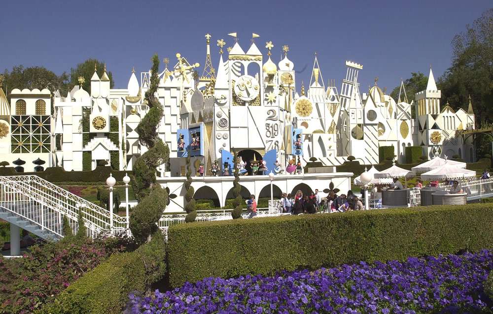
Walt was in a time crunch; he had agreed to do a pavilion for the 1964 World’s Fair in Queens that centered around the children of the world (for Pepsi and UNICEF). But he had less than a year to complete the hugely ambitious project, and wanted a sensibility that spoke to both the young and the young at heart. Remembering the fine work she had done on the post-South America projects that combined an innate understanding of specific global cultures with a universally understood playfulness, he called Blair and asked if she wanted to be a part of it. “I think it hit her at the right time, since it was about children, the freedom of color, and that Walt had asked her to do it,” Imagineer Rolly Crump later said.

And it was true–this was a perfect vehicle for Blair. She brought oodles of charm. Her designs of children, with the big saucer eyes and oversized heads, can be traced back as far as the “Penelope” short. Her graphic style would be perfect for the complex show scenes, and her attention to detail and ability to turn a complex culture into one that is easily relatable through a modern visual shorthand, was imperative for the attraction’s success. And the colors … oh, the colors.
“it’s a small world,” which would turn out to be a wildly important achievement, remains one of the purest distillations of Blair’s work. Not just her design aesthetic, although that is also at the forefront, but her emotional temperature, her unique sensibilities, and her outlook on the world. There was a reason that all of her work was so vivid and full of pizzazz: She remained hopeful, even when the world teetered on the brink. (And, in 1964, the future looked just as uncertain as when she had taken that South American trip.) When the attraction was moved to Disneyland in 1966 and greatly expanded, Imagineers like Crump worked hard to mimic the style and personality that had made the original World’s Fair experience so memorable.
When Tomorrowland at Disneyland was revamped in 1967, Blair unveiled a pair of huge murals as part of what was then known as the Tomorrowland Promenade. They faced each other; one was on the building that housed Adventure Through Inner Space and the other was on the outside of the Circle-Vision 360 theater. They formed a 54-foot-long, 15 and ½ foot high “corridor of murals.” (They were covered over in 1987 and 1998, respectively, as Tomorrowland reminds us that the future is always changing.) According to Sklar, the ceramic-tile murals, depicting the smiling faces of children of every nation, weren’t damaged or removed; they were simply encased. Sklar claims that somewhere, underneath new images and attractions, lies Blair’s sunny futurism. They’re “hidden treasures at Disneyland!” he enthused.

For her last Disney mural, Blair went big. She designed a ninety-foot centerpiece for the Grand Canyon Concourse atrium of Walt Disney World’s Contemporary Resort. When Walt Disney World opened in 1971, the Contemporary was nothing short of revolutionary–its bold geometric design, the fact that the monorail went through the hotel. In fact, part of the reason that the Contemporary looks the way it does is that because, in the early days of Walt Disney World, you could see the hotel from Tomorrowland in the Magic Kingdom. It had to fit in with that warm vision of the future. And one of the most impressive aspects of the hotel is Blair’s centerpiece. The mural, done in the same style as her earlier Disneyland pieces, is a tribute to the Grand Canyon, featuring stylized birds, flowers, animals, and plant life. It’s inviting, playful, and totally her. Even as the scope and scale of her projects expanded, that connection to the South American trip was still present. You can see the influence in depictions of donkeys and Native American children, and with its earthy color scheme. You can also get pretty close to the mural, as it dips down to the resort’s Contempo Café. Walking through the grand atrium of the Contemporary, or even whisking by on the monorail, it’s hard not to be outright dazzled by her design. Like the hotel, she was a true contemporary, unafraid to push modernity to the forefront while still acknowledging the past.
And you can still see Mary Blair today–not only in her theme park contributions and still-in-print Golden Books–but in the retrospectives of her work that have been exhibited everywhere from Main Street at Disneyland to the Walt Disney Family Museum in San Francisco, in the series of designer clothing that incorporates her sketches, in the work of the countless animators and filmmakers who strive for that “Mary Blair feeling.” In 2011, Google even dedicated one of their daily “doodles” to her. What makes her work so remarkable is that she is so easily identifiable. You can glimpse one background, one sketch, one character in an attraction, and know that it is Mary Blair’s. You can’t say that about other artists at the studio at that time, since they so wholly serviced the vision of Walt Disney. The fact that Blair could stray from the pack, take so many stylistic departures and experiment so wildly, is proof that she was a singular visionary. He work was magnificent and wholly ahead of its time. Looking back, it’s clear that she was only looking forwards.